WeekPicker
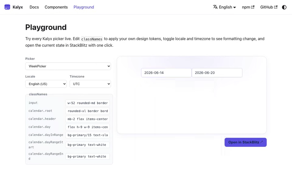
Week selector. A single click commits the entire week containing the clicked day, based on weekStartsOn. The value is a DateRange spanning all seven days.
import { WeekPicker, type DateRange } from '@kalyx/react';
Anatomy
<WeekPicker>            {/* Root: value = { start, end } of the week */}
  <WeekPicker.Input part="start" /> {/* week-start combobox input */}
  <WeekPicker.Input part="end" />   {/* week-end combobox input */}
  <WeekPicker.Popover> {/* Floating-UI portal, role="dialog" */}
    <WeekPicker.Calendar /> {/* week-highlighting month grid */}
  </WeekPicker.Popover>
</WeekPicker>
Input and Popover are re-exported from RangePicker; a single click in WeekPicker.Calendar commits the whole week containing the clicked day (per weekStartsOn).
Basic usage
import { useState } from 'react';
import { WeekPicker, type DateRange } from '@kalyx/react';

function Example() {
  const [week, setWeek] = useState<DateRange>({ start: null, end: null });
  return (
    <WeekPicker value={week} onChange={setWeek}>
      <WeekPicker.Input part="start" />
      <span>→</span>
      <WeekPicker.Input part="end" />
      <WeekPicker.Popover>
        <WeekPicker.Calendar />
      </WeekPicker.Popover>
    </WeekPicker>
  );
}
Try it live
The live editor runs with
Reactand all Kalyx components in scope, soimportlines are omitted. Copy them in when porting to your project; see the full imports in the non-live blocks above.
function BasicWeekPicker() {
  const [week, setWeek] = React.useState({ start: null, end: null });
  const label = week.start && week.end
    ? `${week.start.slice(0, 10)} → ${week.end.slice(0, 10)}`
    : 'null';
  return (
    <WeekPicker value={week} onChange={setWeek}>
      <div className="kx-live-row">
        <WeekPicker.Input part="start" className="kx-live-input" placeholder="Start" />
        <span aria-hidden>→</span>
        <WeekPicker.Input part="end" className="kx-live-input" placeholder="End" />
      </div>
      <WeekPicker.Popover className="kx-live-popover">
        <WeekPicker.Calendar
          classNames={{
            header: 'kx-live-header',
            title: 'kx-live-title',
            navButton: 'kx-live-nav',
            grid: 'kx-live-grid',
            gridCell: 'kx-live-cell',
            weekdayHeader: 'kx-live-weekday',
            day: 'kx-live-day-range',
            dayInRange: 'kx-live-inrange',
            dayRangeStart: 'kx-live-range-start',
            dayRangeEnd: 'kx-live-range-end',
            dayToday: 'live-day-today',
            dayOutsideMonth: 'kx-live-outside',
          }}
        />
      </WeekPicker.Popover>
      <div className="kx-live-value">
        Week: <code>{label}</code>
      </div>
    </WeekPicker>
  );
}
<WeekPicker.Calendar>
RangePicker.Calendar with selectionMode pinned to 'week', so every other
RangePicker.Calendar prop applies here too.
| Prop | Type | Description |
|---|---|---|
classNames | WeekPickerCalendarClassNames | Styling slots. |
weekAnchor | 'calendar' | 'clicked' (default 'calendar') | How a clicked day becomes a week. 'calendar' snaps to the weekStartsOn-aligned boundary, the usual "week of" behaviour. 'clicked' instead takes the 7-day span anchored on the clicked day itself, which is a different notion of "week". |
showWeekNumber | boolean (default false) | Render an ISO 8601 week-number column (1-53) on the left of the grid. |
fixedWeeks | boolean (default false) | Always render 6 week rows. Without it the grid is 4-6 rows, so the popover changes height from month to month. |
weekStartsOn
The weekStartsOn prop (inherited from RangePicker.Root) controls which day the week begins on: 0 for Sunday, 1 for Monday. When you omit it, the value is inferred from locale (en-US → 0, de-DE → 1); an explicit prop always wins.
function MondayStartWeekPicker() {
  const [week, setWeek] = React.useState({ start: null, end: null });
  const label = week.start && week.end
    ? `${week.start.slice(0, 10)} → ${week.end.slice(0, 10)}`
    : 'null';
  return (
    <WeekPicker value={week} onChange={setWeek} weekStartsOn={1}>
      <div className="kx-live-row">
        <WeekPicker.Input part="start" className="kx-live-input" placeholder="Mon start" />
        <span aria-hidden>→</span>
        <WeekPicker.Input part="end" className="kx-live-input" placeholder="Sun end" />
      </div>
      <WeekPicker.Popover className="kx-live-popover">
        <WeekPicker.Calendar
          classNames={{
            header: 'kx-live-header',
            title: 'kx-live-title',
            navButton: 'kx-live-nav',
            grid: 'kx-live-grid',
            gridCell: 'kx-live-cell',
            weekdayHeader: 'kx-live-weekday',
            day: 'kx-live-day-range',
            dayInRange: 'kx-live-inrange',
            dayRangeStart: 'kx-live-range-start',
            dayRangeEnd: 'kx-live-range-end',
            dayToday: 'live-day-today',
            dayOutsideMonth: 'kx-live-outside',
          }}
        />
      </WeekPicker.Popover>
      <div className="kx-live-value">
        Week: <code>{label}</code>
      </div>
    </WeekPicker>
  );
}
<WeekPicker weekStartsOn={1} value={week} onChange={setWeek}>
  <WeekPicker.Input part="start" />
  <WeekPicker.Popover>
    <WeekPicker.Calendar />
  </WeekPicker.Popover>
</WeekPicker>
With weekStartsOn={1}, clicking any date in, for example, April 14 2026 (Tuesday) commits the range Apr 13 (Mon) → Apr 19 (Sun).
Parts
| Part | Source | Purpose |
|---|---|---|
WeekPicker.Root | wraps RangePicker.Root | controlled/uncontrolled DateRange, displayTimezone, disabled rules, dir (RTL mirrors the calendar grid) |
WeekPicker.Input | = RangePicker.Input | start/end text inputs (part="start" | "end") |
WeekPicker.Popover | = RangePicker.Popover | Floating UI positioning |
WeekPicker.Calendar | wraps RangePicker.Calendar with selectionMode="week" | single-click selects the full week |
Because WeekPicker.Calendar is implemented via the shared selectionMode="week" prop on RangePicker.Calendar, keyboard navigation (arrow keys, Home/End, Page Up/Down) behaves the same as RangePicker; pressing Enter or Space on the focused day commits the full week containing it.
Keyboard
- Arrow keys: move the focused day.
- Home / End: jump to the first / last day of the currently-focused week.
- Page Up / Page Down: previous / next month. Shift + Page Up/Down: previous / next year.
- Enter / Space: commit the full week containing the focused day.
- Escape: close the popover without committing.
Disabled rules
Restrict selectable weeks. Any DisabledRule that matches at least one day in a week disables the entire week.
<WeekPicker
  value={week}
  onChange={setWeek}
  disabled={[{ before: '2026-04-01T00:00:00.000Z' }]}
>
  <WeekPicker.Input part="start" placeholder="Start" />
  <WeekPicker.Input part="end" placeholder="End" />
  <WeekPicker.Popover>
    <WeekPicker.Calendar />
  </WeekPicker.Popover>
</WeekPicker>
Uncontrolled
<WeekPicker defaultValue={{ start: '2026-04-13T00:00:00.000Z', end: '2026-04-19T00:00:00.000Z' }}>
  <WeekPicker.Input part="start" />
  <WeekPicker.Input part="end" />
  <WeekPicker.Popover>
    <WeekPicker.Calendar />
  </WeekPicker.Popover>
</WeekPicker>
For native form submission, pass name to either endpoint input. A hidden field
submits that endpoint's UTC-ISO value while the visible formatted input remains
unnamed.
Timezone
Inherited from RangePicker.Root. With displayTimezone set, the start and end of the week are emitted as civil midnight in that zone (UTC-ISO form).
Props
WeekPicker Root accepts the same props as RangePicker.Root. See RangePicker for the full reference.
Calendar classNames
Same shape as RangePicker.Calendar classNames, with an extra dayInRange modifier that styles every cell of the selected week:
<WeekPicker.Calendar
  classNames={{
    root: '',
    day: '',
    dayInRange: 'bg-blue-100',
    dayRangeStart: 'rounded-l',
    dayRangeEnd: 'rounded-r',
    dayToday: 'font-bold',
    /* ...and all other RangePicker.Calendar classNames */
  }}
/>
WeekPicker.Calendar wraps RangePicker.Calendar, so day cells emit the same data-range-start / data-range-end / data-in-range / data-today / data-focused / data-outside-month attributes; the whole committed week spans start→end. See Styling.