YearPicker
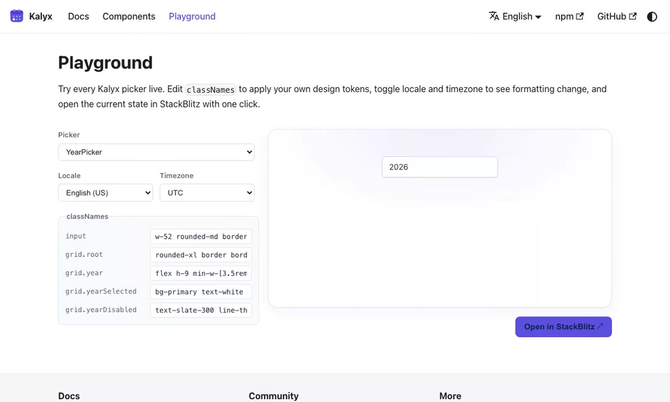
Year selector. The value is January 1 of the selected year in UTC-ISO form. For example, picking 2026 yields "2026-01-01T00:00:00.000Z".
import { YearPicker } from '@kalyx/react';
Anatomy
<YearPicker>            {/* Root: value = Jan 1 of the year, UTC */}
  <YearPicker.Input /> {/* combobox <input>, parses "YYYY" */}
  <YearPicker.Trigger /> {/* button that toggles the popover */}
  <YearPicker.Popover> {/* Floating-UI portal, role="dialog" */}
    <YearPicker.Grid /> {/* paginated grid of years, role="grid" */}
  </YearPicker.Popover>
</YearPicker>
Input and Trigger are re-exported from DatePicker and read the YearPicker context.
Basic usage
import { useState } from 'react';
import { YearPicker, type ISODateString } from '@kalyx/react';

function Example() {
  const [year, setYear] = useState<ISODateString | null>(null);
  return (
    <YearPicker value={year} onChange={setYear}>
      <YearPicker.Input placeholder="YYYY" />
      <YearPicker.Popover>
        <YearPicker.Grid />
      </YearPicker.Popover>
    </YearPicker>
  );
}
The default displayFormat is "yyyy".
Try it live
The live editor runs with
Reactand all Kalyx components in scope, soimportlines are omitted. Copy them in when porting to your project; see the full imports in the non-live blocks above.
function BasicYearPicker() {
  const [year, setYear] = React.useState(null);
  const headerCls = {
    header: 'kx-live-header',
    title: 'kx-live-title',
    navButton: 'kx-live-nav',
  };
  return (
    <YearPicker value={year} onChange={setYear}>
      <div className="kx-live-row">
        <YearPicker.Input className="kx-live-input" placeholder="YYYY" />
        <YearPicker.Trigger className="kx-live-trigger" aria-label="Open year picker" />
      </div>
      <YearPicker.Popover className="kx-live-popover">
        <YearPicker.Grid
          classNames={{
            ...headerCls,
            grid: 'kx-live-year-grid',
            year: 'kx-live-my-cell',
            yearSelected: 'kx-live-my-selected',
            yearCurrent: 'kx-live-my-current',
          }}
        />
      </YearPicker.Popover>
      <div className="kx-live-value">
        Selected: <code>{year ?? 'null'}</code>
      </div>
    </YearPicker>
  );
}
Parts
| Part | Source | Purpose |
|---|---|---|
YearPicker.Root | wraps DatePicker.Root | controlled/uncontrolled state, displayTimezone, disabled rules, dir (RTL mirrors the year grid) |
YearPicker.Input | = DatePicker.Input | text input (combobox role) |
YearPicker.Trigger | = DatePicker.Trigger | icon button |
YearPicker.Popover | = DatePicker.Popover | Floating UI positioning |
YearPicker.Grid | new | 12-year decade grid with prev/next decade navigation |
The grid displays the decade block containing the current year (e.g., 2016-2027 when the value is 2026). Navigate by 12 years at a time using the header buttons.
Timezone
When displayTimezone is set, year highlighting is timezone-aware. This matters when the stored UTC-ISO has been shifted to represent civil midnight in a non-UTC zone.
<YearPicker value={year} onChange={setYear} displayTimezone="America/New_York">
  <YearPicker.Input />
  <YearPicker.Popover>
    <YearPicker.Grid />
  </YearPicker.Popover>
</YearPicker>
Disabled rules
Restrict selectable years. A year is disabled only when the rules exclude every day in that year; a rule that blocks January 1 alone does not disable the remaining year.
function DisabledYearPicker() {
  const [year, setYear] = React.useState(null);
  const headerCls = {
    header: 'kx-live-header',
    title: 'kx-live-title',
    navButton: 'kx-live-nav',
  };
  return (
    <YearPicker
      value={year}
      onChange={setYear}
      disabled={[
        { before: '2020-01-01T00:00:00.000Z' },
        { after: '2030-01-01T00:00:00.000Z' },
      ]}
    >
      <div className="kx-live-row">
        <YearPicker.Input className="kx-live-input" placeholder="2020–2030" />
        <YearPicker.Trigger className="kx-live-trigger" aria-label="Open year picker" />
      </div>
      <YearPicker.Popover className="kx-live-popover">
        <YearPicker.Grid
          classNames={{
            ...headerCls,
            grid: 'kx-live-year-grid',
            year: 'kx-live-my-cell',
            yearSelected: 'kx-live-my-selected',
            yearCurrent: 'kx-live-my-current',
            yearDisabled: 'kx-live-disabled',
          }}
        />
      </YearPicker.Popover>
      <div className="kx-live-value">
        Selected: <code>{year ?? 'null'}</code>
      </div>
    </YearPicker>
  );
}
<YearPicker
  value={year}
  onChange={setYear}
  disabled={[
    { before: '2020-01-01T00:00:00.000Z' },
    { after: '2030-01-01T00:00:00.000Z' },
  ]}
>
  <YearPicker.Input placeholder="2020–2030" />
  <YearPicker.Popover>
    <YearPicker.Grid />
  </YearPicker.Popover>
</YearPicker>
Uncontrolled
<YearPicker defaultValue="2026-01-01T00:00:00.000Z">
  <YearPicker.Input name="fiscalYear" />
  <YearPicker.Popover>
    <YearPicker.Grid />
  </YearPicker.Popover>
</YearPicker>
YearPicker.Input inherits DatePicker.Input's native form contract. Passing
name renders a hidden input containing the year-start UTC ISO value; the
visible formatted input is not submitted under that name.
Event callbacks
| Prop | Signature | Fires when |
|---|---|---|
onChange | (value: ISODateString | null) => void | A year is committed (click or input typed). |
onOpenChange | (isOpen: boolean) => void | The popover opens or closes. |
onCalendarNavigate | (viewMonth: ISODateString) => void | The grid navigates to a different decade. |
Props
YearPicker Root accepts the same props as DatePicker.Root. Only the default displayFormat differs. See DatePicker for the full reference.
Grid classNames
<YearPicker.Grid
  classNames={{
    root: '',
    header: '',
    title: '',
    navButton: '',
    grid: '',
    gridRow: '',
    year: '',
    yearSelected: '',
    yearCurrent: '',
    yearDisabled: '',
  }}
/>
Each year cell emits data-selected, data-current, and data-focused (active-only). See Styling.